Brothers Barber REBRANDING
CASE STUDY
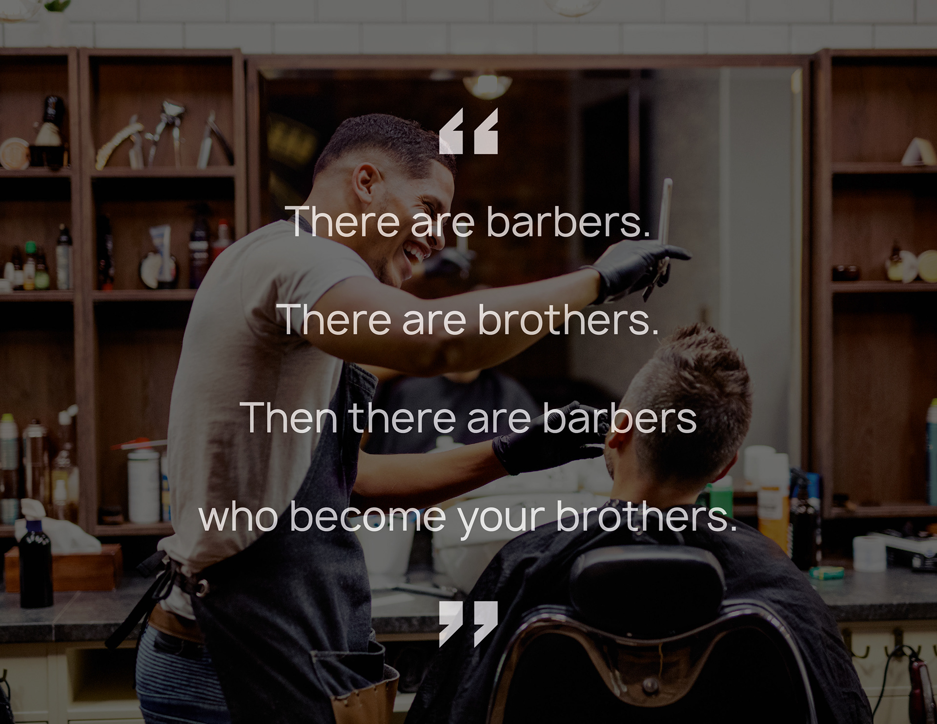
While the term ‘brother’ has been used in jest across the world to describe a friend that they have a strong bond with, that term was more than just endearment in Hong Kong culture. If you are someone’s brother, the intrinsic triad links meant you would die for them—all too often, quite literally.
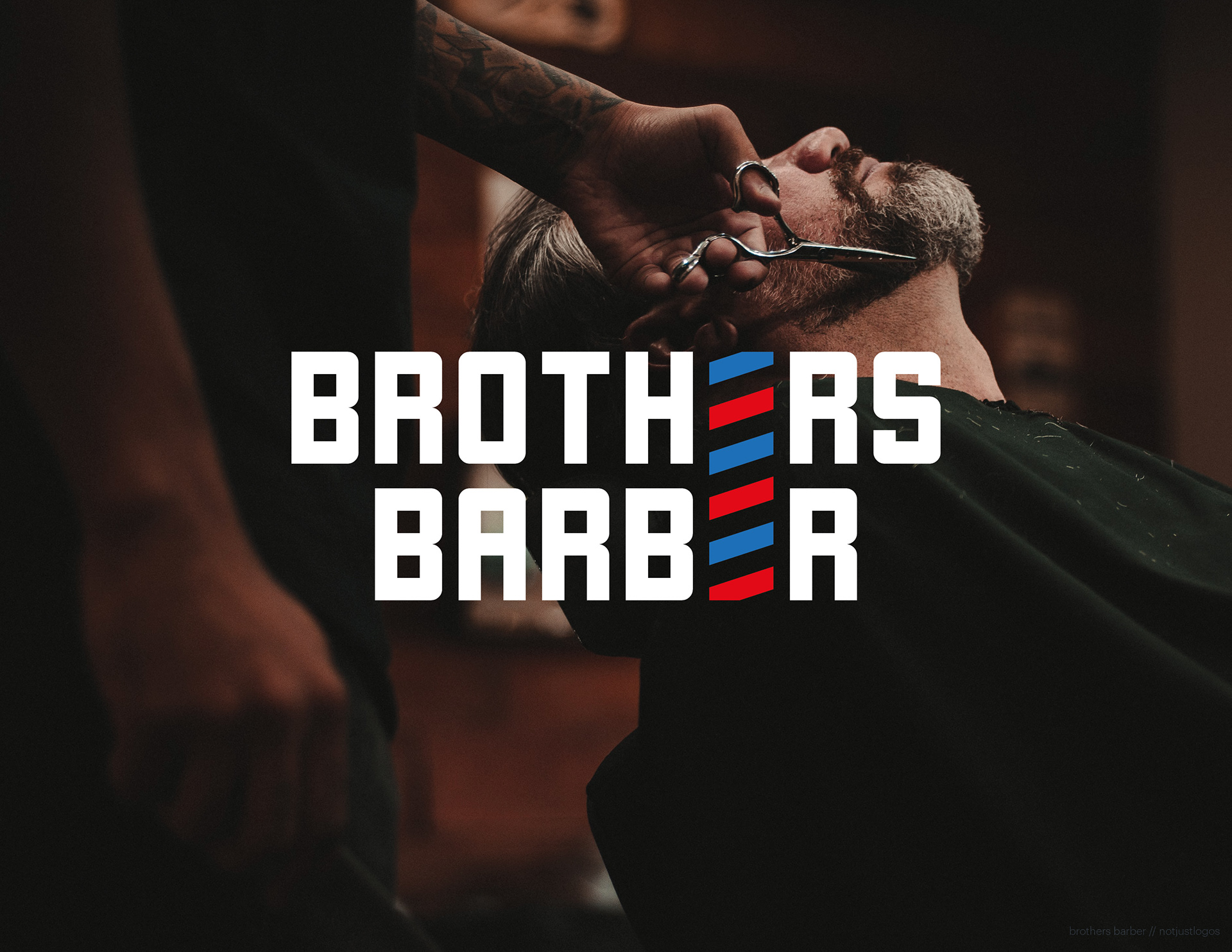
Brothers Men barbers had been long-established since the 1980s, at the height of the gangster-look trend. The old logo and sign certainly reflected that too—the kind of graffiti-style mark seen in graphic comics influenced by triad stories.
The trend began to fade at the beginning of the 2000s. The barbershop is now being run by the next generation—sons of previous ‘brothers’. And they wanted a modern rebrand—not the vintage, traditional aesthetic that is popping up all over in the barbering world. They want to build the same bonds of brotherhood with their clientele but without the gangster connotations. It is just a barbershop, after all.

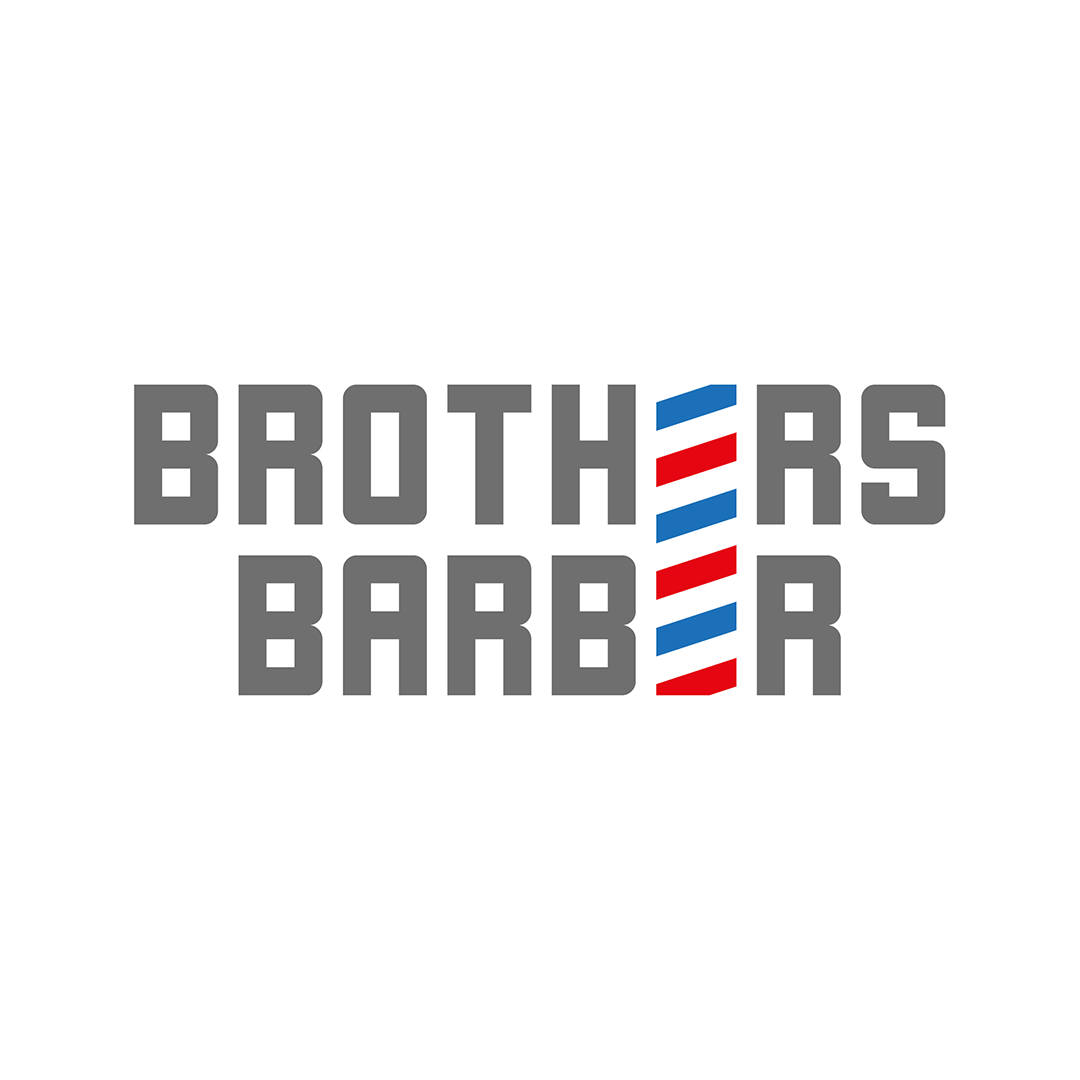
The term ‘brother’ has enough connotations to friendship to stand on its own without the need any further logo gimmicks to hammer the point home. It was also decided to drop the ‘men’ part of the name and use the word ‘barber’ instead.
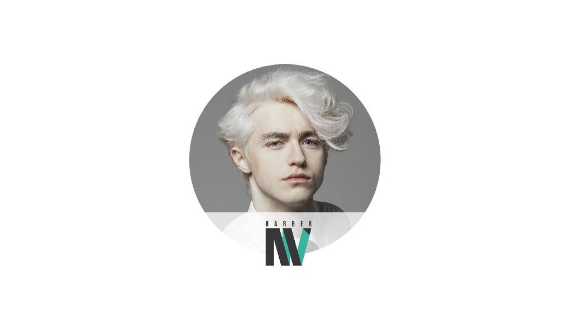
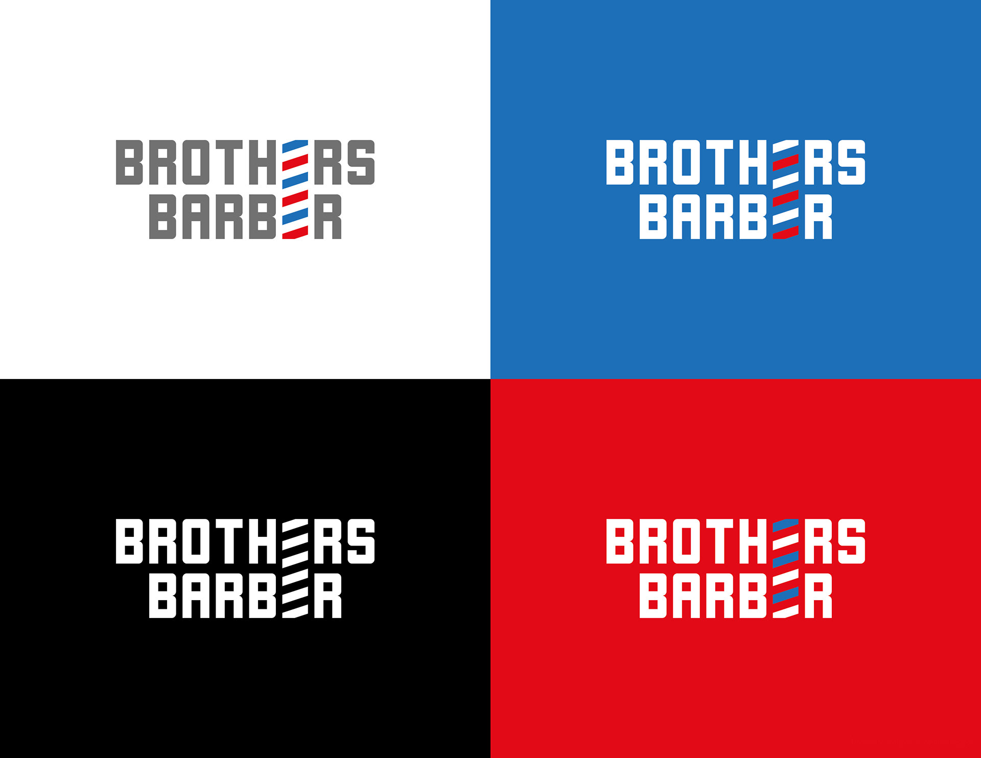
The blocky geometric nature of the main font used in the name contrasts perfectly with the stylised letter Es forming the stripes of the barber pole. You can see in the all-white version of the logo that the sudden slants stand out very well from the name.
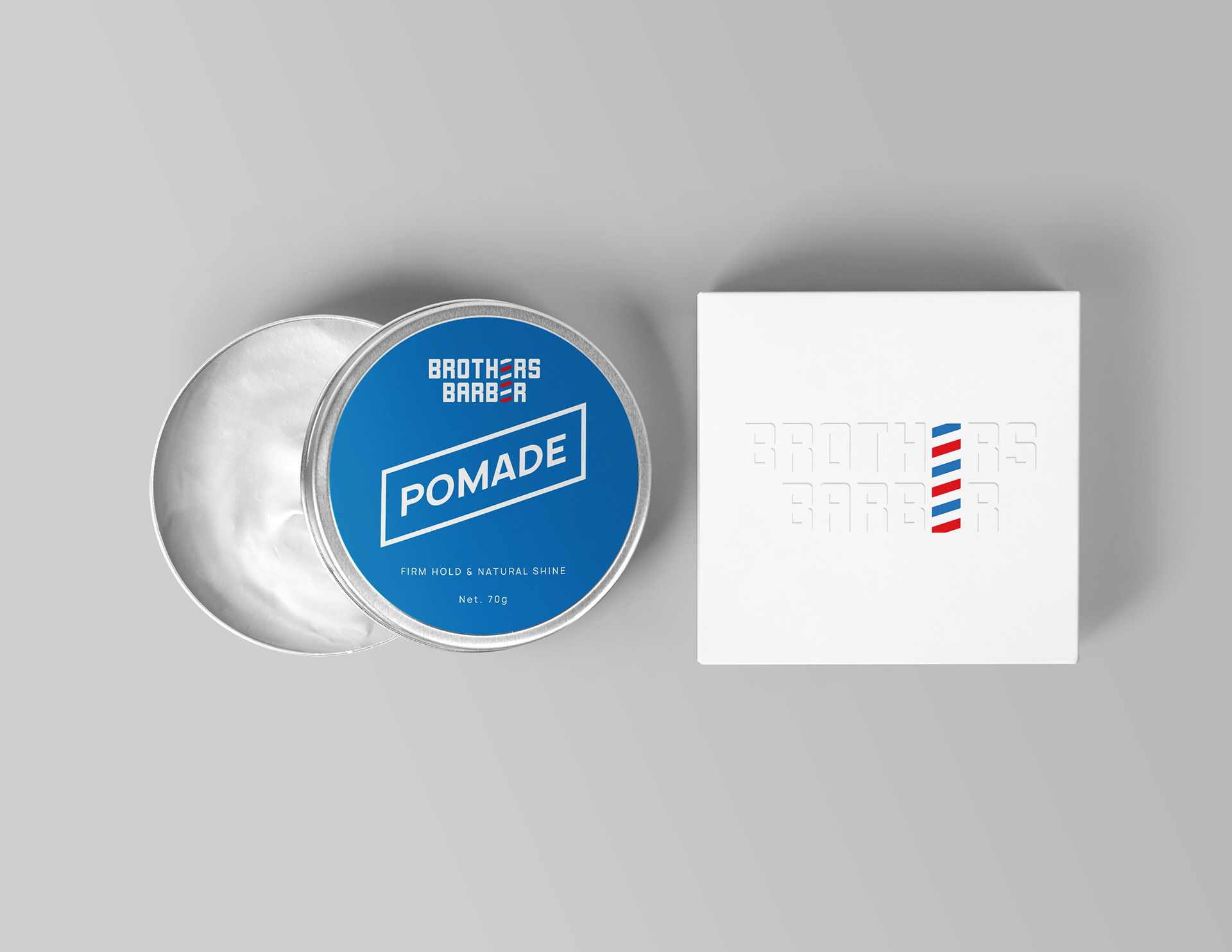
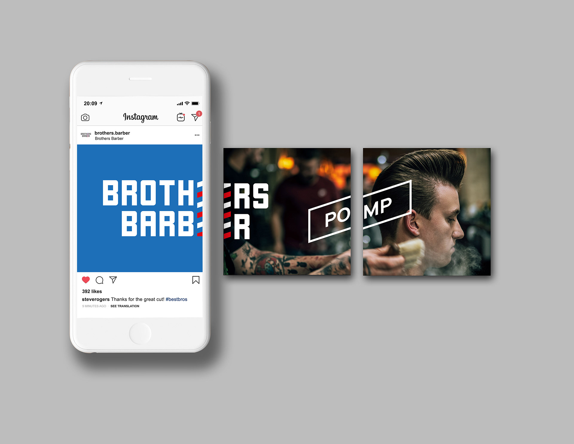
The individual blocks forming the barber pole works as a strong graphic element in applications too—as seen used as a bounding box.
Thank you for browsing this project.