CloudQitchens BRANDING & LOGO DESIGN
CASE STUDY
The client needed a fresh and stand-out brand look and logo for their new startup, Scotland's first ever dark kitchen. The concept is modern and exciting and the style and voice needed to match. It needed to let people know what CloudQitchens is all about at a glance.
SOLUTION
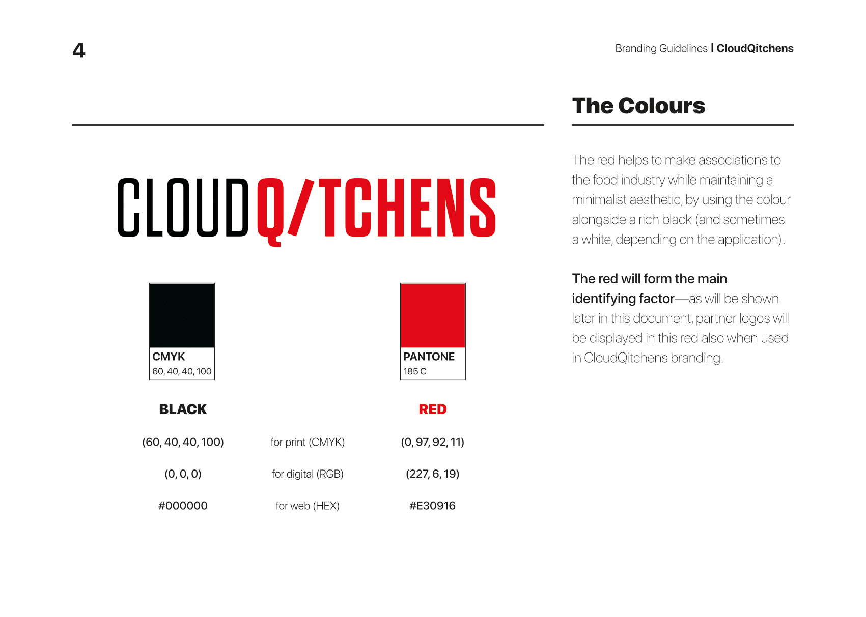
After a research and discovery into the sector and CloudQitchens' potential competitors, it was decided that using the full name can help improve visibility and memorability, important for a brand looking to establish itself before the market has even been established.
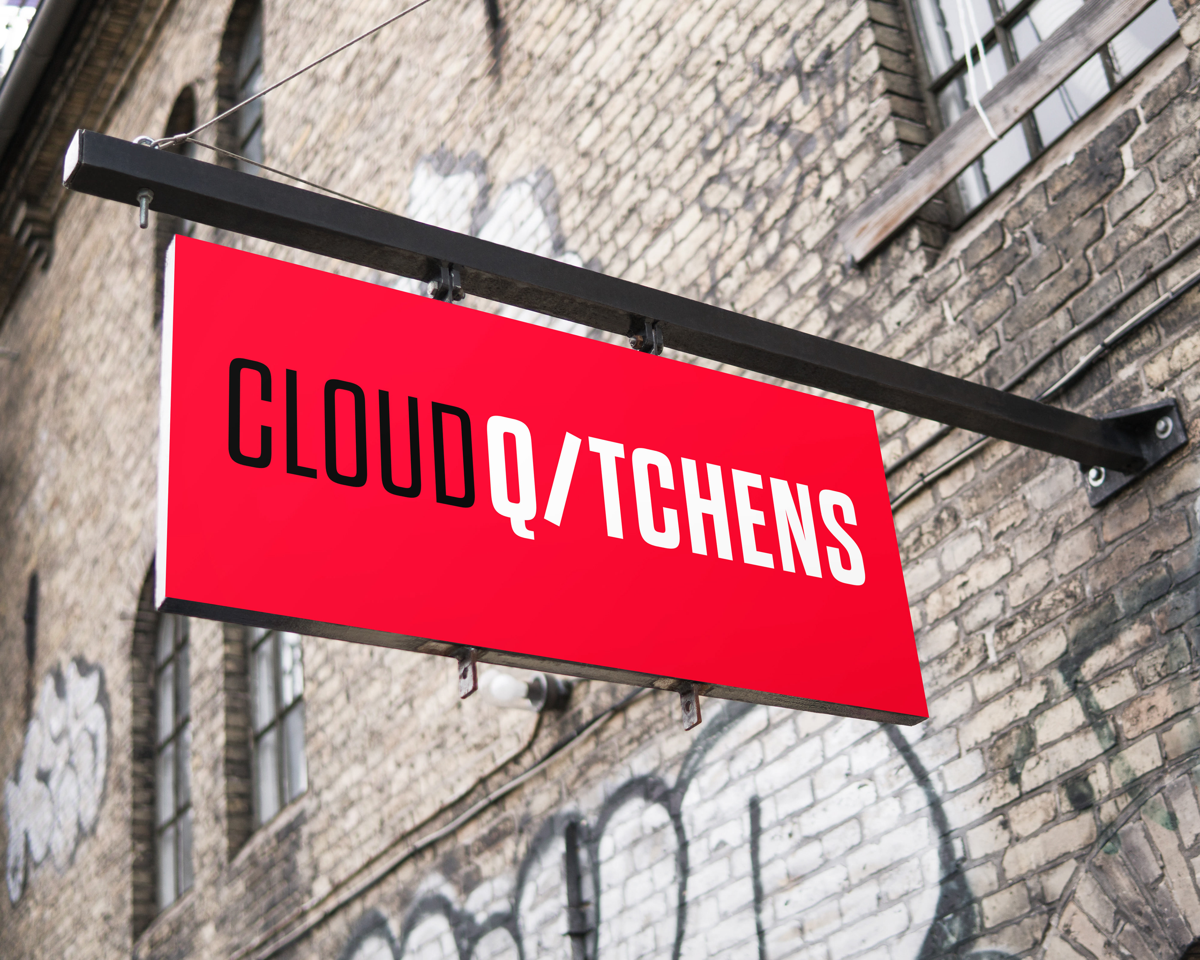
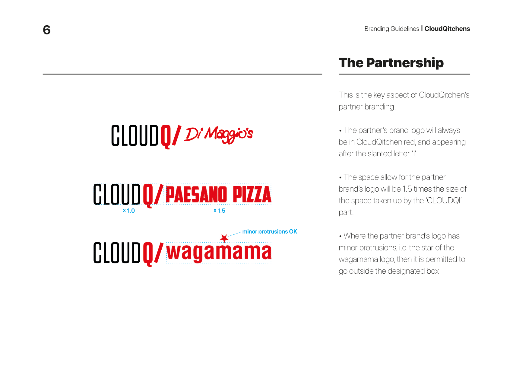
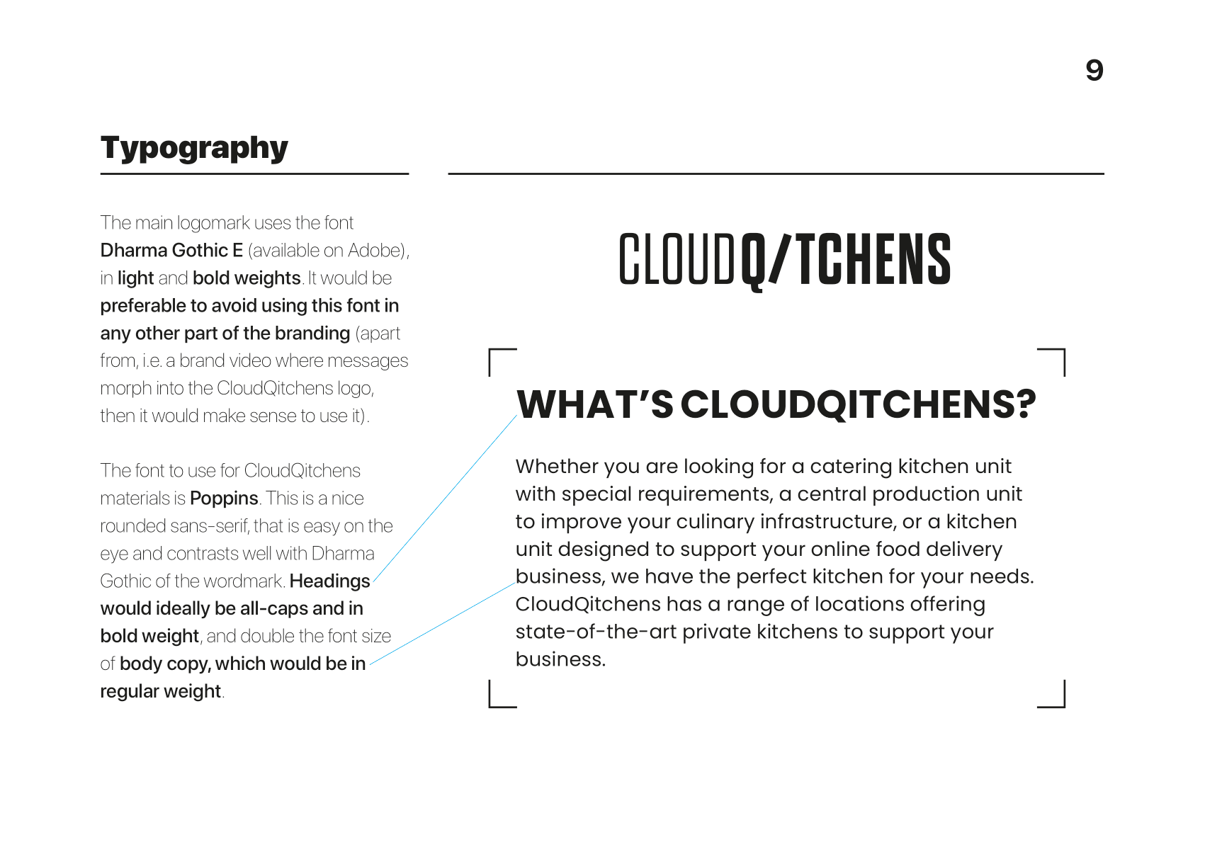
The slanted letter 'I' will be used as a common symbolic device, and in the logo, it is used to illustrate the major branding message of the design, which is that CloudQitchens will be the 'partners' of the businesses who decide to come on board with the company. It will be a union of equality and mutual benefit, and this message is strengthened with the equal number of 6 letters on each side of the letter 'I'.
The slanted letter 'I' will be used as a common symbolic device, and in the logo, it is used to illustrate the major branding message of the design, which is that CloudQitchens will be the 'partners' of the businesses who decide to come on board with the company. It will be a union of equality and mutual benefit, and this message is strengthened with the equal number of 6 letters on each side of the letter 'I'.
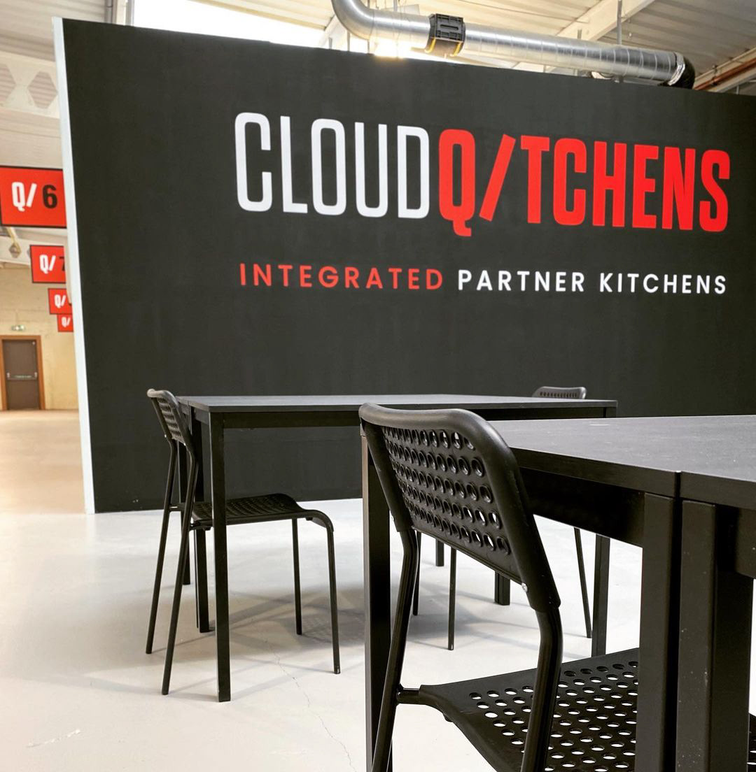
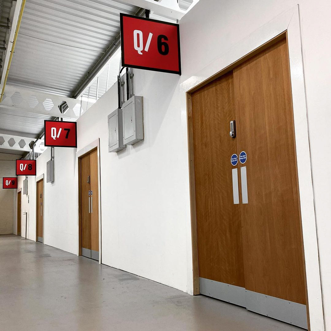
SIGNAGE DESIGN
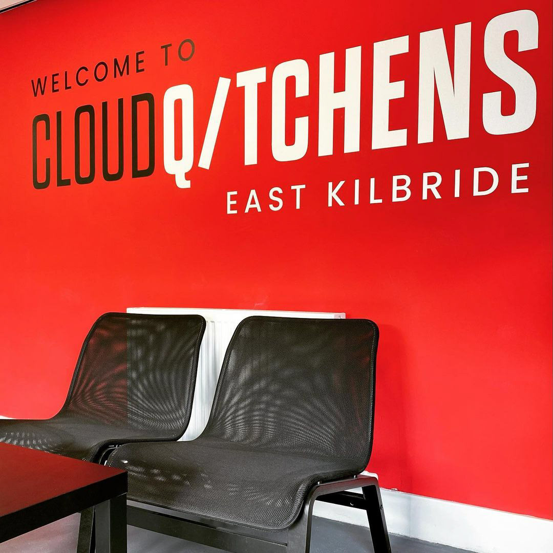
Local signage specialists Centurion Signs were commissioned to manufacture and install exterior and interior signage work that was designed by myself. The top two images show the kitchens area, with a waiting area for delivery drivers and signposted kitchens.
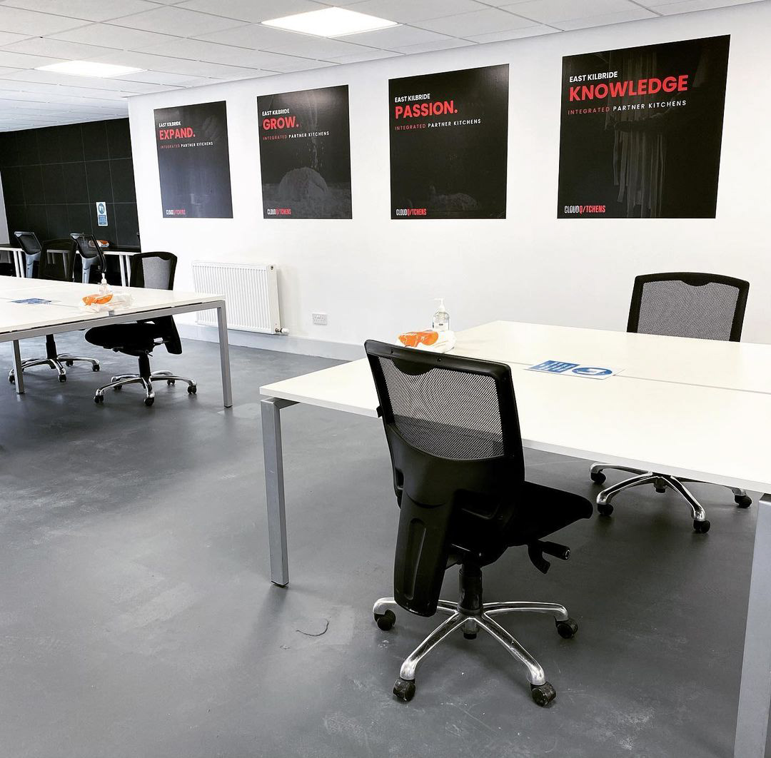
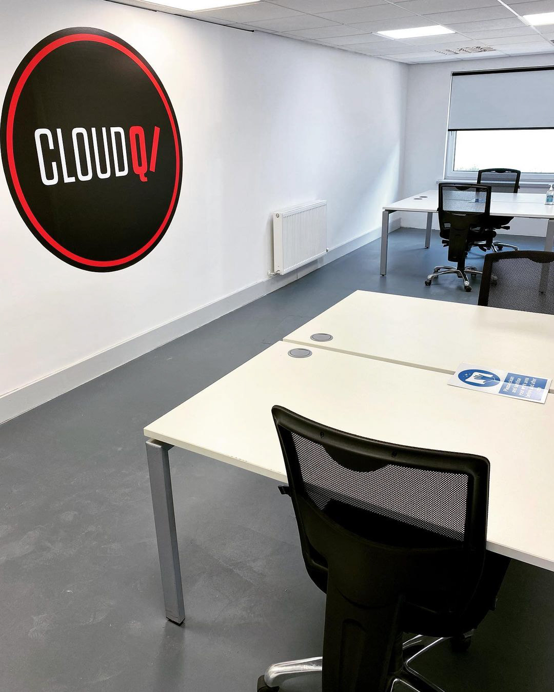
The bottom three images show the branded front office and co-working space.
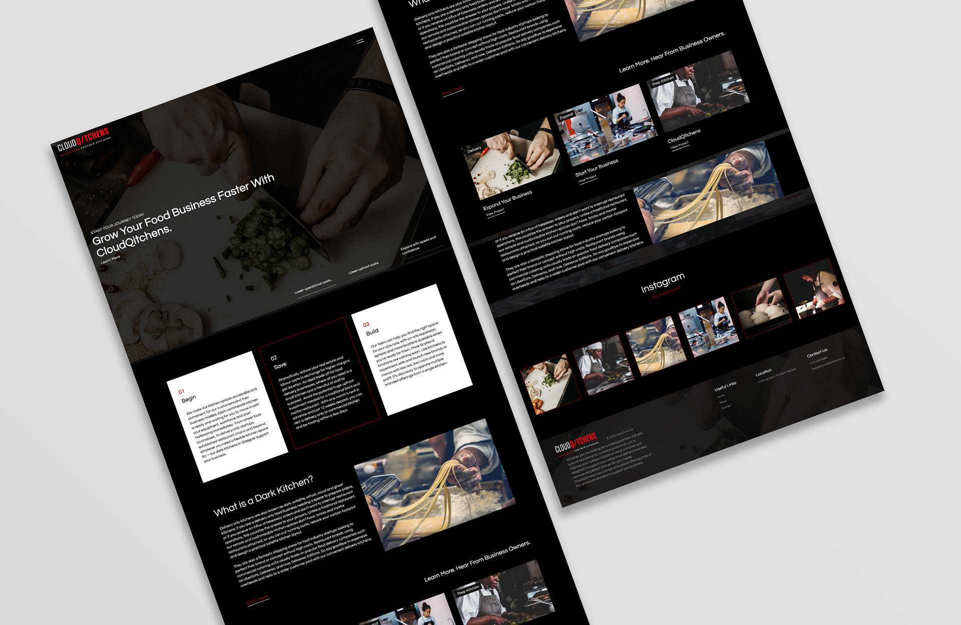
[ website designed and maintained by Blacktide Marketing, Glasgow. Displayed only to illustrate implementation of branding ]
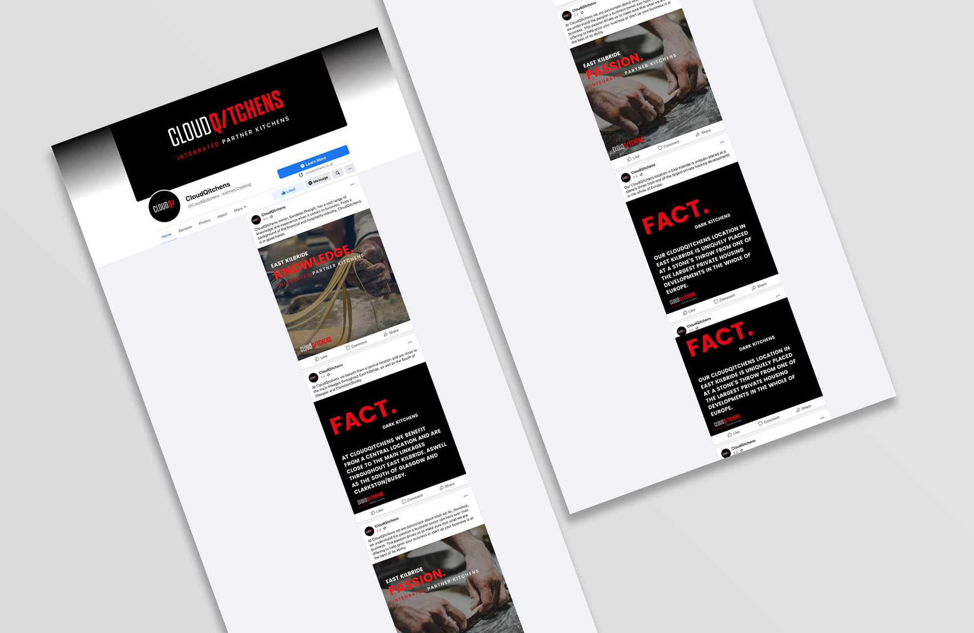
[ Facebook page maintained by Blacktide Marketing, Glasgow. Displayed only to illustrate implementation of branding ]
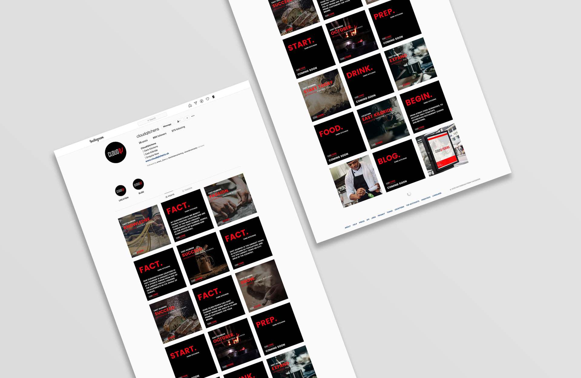
[ Instagram page maintained by Blacktide Marketing, Glasgow. Displayed only to illustrate implementation of branding ]